So, you may have noticed that my blog got a makeover. (If you view my blog in a reader be sure to click on over to see the new design, and also visit my shiny new October sponsors on the left!) This project was always on the back burner so it took me months of sketching and experimenting. My design concept changed a lot throughout this process until I finally settled on “the one.” I didn’t want to change anything until I was 100% happy with it.
I had two main goals for my redesign:
1.) Bigger photos – I love me some photos. I love me some big photos even more. In my redesign I ensured that the main focus is the content. Having bigger photos will also challenge me to improve my daily life photography.
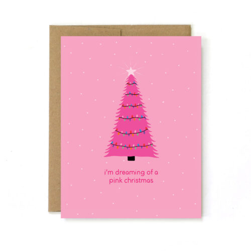
2.) A cohesive look – The more I developed my card style, the more I felt like my blog didn’t go along with it. I made a goal to design my blog the same way I design my cards, to create a cohesive branding throughout. I think most will agree this design is much more “my style.”
This was a really fun project and I’m happy with the simple, clean result. Let me know what you think! I hope you like it! xo JA



I love it. clean simple and easy to read and navigate, nice look- great job! 🙂 have a good tuesday!
Your new design is so pretty!! I appreciate the simplicity of it, but the little “sketch” style banners add a personal touch. Definitely fits nicely with your shop!
P.S. I had to go back and check a few previous entries just to be sure (and avoid sounding like a total idiot) but I am also a huge fan of the new giant post/picture width! Certainly captures my attention. =)
It looks awesome! So clean and simple.
I love it, it’s so clean and simple. Good job! 😀
I love it! And you’re right, it’s SOOO you!
Love the new blog design – and I love the adorable pregnancy card I recently ordered from your Etsy shop! My newly pregnant friend will get a kick out of it 🙂
awww cute makeover! i am getting one too soon!!
xo,
Sandy
Sandy a la Mode
Absolutely love the makeover!
I love it! I recently took my 3rd column out for wider photo space too, and I totally don’t regret it. But, seriously so simple and pretty!
I love it!! I was also thinking of going back to big photos…but it took me a while to get my layout where it is right now haha.
Love it 🙂
xo
Love the simplicity and neatness to your new designs! Look forward to seeing more 😀 xo
Love it! you rock <3
It’s perfect! Great job and way to stay focused on creating exactly what you want 🙂
Love your new blog makeover. It looks great:). Hi from your newest follower!
meg @ eat.live.make